

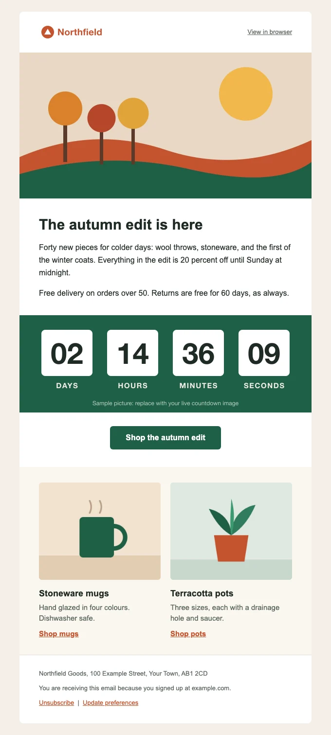
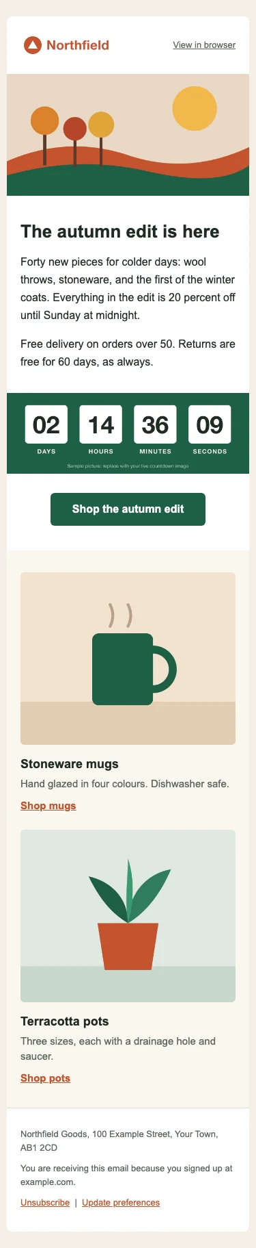
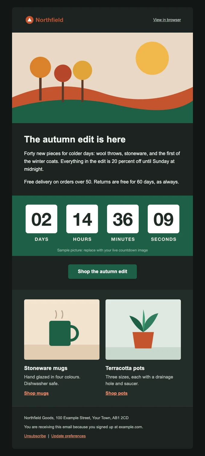
An HTML email template is one HTML file, laid out with tables and styled mostly with inline CSS, so that Gmail, Outlook and Apple Mail all draw it the same way. You can download the template file here for free: a responsive 600 pixel starter with a header, a hero image, a text section, a bulletproof button, two columns that stack on phones, a slot for a live countdown image, a footer, and dark mode support.
The file is 17 KB, every section is commented, and there is no external CSS. Below, each part of the code is explained with the reason it is there and the client it is for, with Google’s, Microsoft’s and caniemail’s documentation cited for each decision. After the walkthrough: how to change the colours and add sections, how to load the file into Klaviyo, Mailchimp and HubSpot, the tests to run, and a checklist for the send.
What the template contains
| Section | What it does | The client it is mainly for |
|---|---|---|
| Head and meta tags | Character set, phone scaling, dark mode hints | Apple Mail, iOS Mail, all phones |
| Outlook settings block | 96 DPI scaling and an Arial fallback | Classic Outlook for Windows |
| Style block | Resets, the phone layout, dark mode colours | Gmail, Apple Mail, Outlook.com, Yahoo |
| Wrapper and preheader | Screen reader landmark, the inbox preview line | Screen readers, every inbox list |
| 600 pixel container | A fluid column with a fixed Outlook “ghost table” | Classic Outlook for Windows |
| Header, hero, text | Logo, a 600 by 300 image, headline and copy | All clients |
| Live image slot | A plain <img> for a countdown timer or personalized image |
All clients |
| Bulletproof button | A table button, plus a VML shape for Outlook | Classic Outlook for Windows |
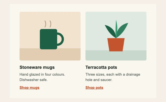
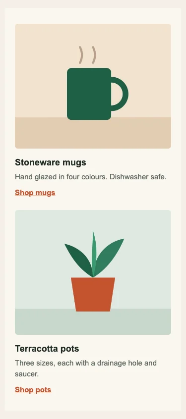
| Two columns | Side by side on desktop, stacked on phones | Phones, Outlook gets fixed cells |
| Footer | Address and unsubscribe placeholders | Your sending platform’s compliance check |
Why email HTML is still written with tables
Email clients do not share one rendering engine, and the oldest one still in use sets the rules; how HTML email renders compares all three. Microsoft’s documentation states that Outlook 2007 “uses the HTML parsing and rendering engine from Microsoft Office Word 2007”, and the same page lists max-width, float, position and background-image among the CSS properties that engine does not support. Classic Outlook for Windows has kept that engine, which is why caniemail’s tests still show no media query support for Outlook 2016 and 2019 for Windows. Tables, width attributes and padding on cells are what the Word engine understands, so they are the skeleton.
Gmail is the other constraint. Google’s CSS page says Gmail supports <style> blocks with “class, element, and ID selectors” and media queries “against screen width, orientation, and resolution”. That is enough for a phone layout, but not for everything a web page does, and caniemail adds two limits: Gmail does not read <style> inside <body>, and it keeps a <style> block only up to 16 KB.
So the template follows three rules. Everything that must look right everywhere is inline on the element. The <style> block only adds things that can safely fail: resets, the phone layout and dark mode. And Outlook for Windows gets its own code inside <!--[if mso]> comments, which only it reads.
The email boilerplate, short version
If you want the bare skeleton without the sample content, this is the boilerplate the template is built on. It is complete: paste it into a file, put your rows inside the inner table, and it will send.
<!DOCTYPE html>
<html lang="en" dir="ltr" xmlns="http://www.w3.org/1999/xhtml" xmlns:v="urn:schemas-microsoft-com:vml" xmlns:o="urn:schemas-microsoft-com:office:office">
<head>
<meta charset="utf-8">
<meta name="viewport" content="width=device-width, initial-scale=1">
<meta name="x-apple-disable-message-reformatting" content="true">
<meta name="format-detection" content="telephone=no, date=no, address=no, email=no, url=no">
<meta name="color-scheme" content="light dark">
<meta name="supported-color-schemes" content="light dark">
<title>Your subject line</title>
<!--[if mso]>
<noscript><xml><o:OfficeDocumentSettings><o:PixelsPerInch>96</o:PixelsPerInch></o:OfficeDocumentSettings></xml></noscript>
<style>table, td, th, div, p, a, h1, h2, h3 { font-family: Arial, Helvetica, sans-serif; }</style>
<![endif]-->
<style>
:root { color-scheme: light dark; supported-color-schemes: light dark; }
body { margin: 0 !important; padding: 0 !important; width: 100% !important; -webkit-text-size-adjust: 100%; }
table, td { border-collapse: collapse; mso-table-lspace: 0pt; mso-table-rspace: 0pt; }
img { border: 0; outline: none; text-decoration: none; -ms-interpolation-mode: bicubic; }
@media screen and (max-width: 620px) {
.px { padding-left: 20px !important; padding-right: 20px !important; }
}
</style>
</head>
<body class="body" xml:lang="en" style="margin:0; padding:0; background-color:#f4efe6;">
<div role="article" aria-roledescription="email" aria-label="Your subject line" lang="en" dir="ltr" style="background-color:#f4efe6;">
<div style="display:none; font-size:1px; line-height:1px; max-height:0; max-width:0; opacity:0; overflow:hidden; mso-hide:all;">Your preheader text.͏‌ ͏‌ ͏‌ </div>
<table role="presentation" width="100%" cellpadding="0" cellspacing="0" border="0" style="background-color:#f4efe6;">
<tr><td align="center" style="padding:24px 10px;">
<!--[if mso]><table role="presentation" align="center" width="600" cellpadding="0" cellspacing="0" border="0"><tr><td width="600"><![endif]-->
<table role="presentation" width="100%" cellpadding="0" cellspacing="0" border="0" style="width:100%; max-width:600px; margin:0 auto;">
<tr>
<td class="px" style="background-color:#ffffff; padding:32px 40px; font-family:Arial, Helvetica, sans-serif; font-size:16px; line-height:26px; mso-line-height-rule:exactly; color:#1f2a24;">
Your content goes here, one table row per section.
</td>
</tr>
</table>
<!--[if mso]></td></tr></table><![endif]-->
</td></tr>
</table>
</div>
</body>
</html>
The full template adds the sections, the two-column pattern, the button and the dark mode rules. Each one is explained below in the order it appears in the file.
The template, section by section
Doctype, html tag and namespaces
The file opens with the HTML5 doctype. Caniemail’s doctype tests show most clients honour it, and note that for Outlook for Windows “the HTML5 doctype has no impact”. It costs nothing and keeps browser-based clients in standards mode.
The <html> tag carries lang="en" and dir="ltr" for screen readers and translation, plus two namespaces. xmlns:v declares VML, which the button uses, and xmlns:o declares the Office namespace used by the settings block. Change lang to your language before you send.
Meta tags
charset="utf-8"covers every character and symbol you are likely to use.viewporttells phones to lay the email out at the device width rather than a zoomed-out desktop width.x-apple-disable-message-reformattingis Apple specific. Mark Robbins’ Good Email Code explains that iOS Mail tried to rescale emails it judged not to be mobile friendly, and that this tag stops it so your own responsive code is used. Apple does not document the tag; it is in the template because it does no harm elsewhere.format-detectionasks clients not to turn numbers, dates and addresses into links. Good Email Code reports that support is low, so treat it as a hint.color-schemeandsupported-color-schemeswithlight darktell clients the email has its own dark styles. Caniemail lists the meta tag as supported by Apple Mail for macOS, and almost nothing else, which is why the same values are repeated in CSS on:root.
The Outlook settings block
<!--[if mso]>
<noscript>
<xml>
<o:OfficeDocumentSettings>
<o:PixelsPerInch>96</o:PixelsPerInch>
</o:OfficeDocumentSettings>
</xml>
</noscript>
<style>
table, td, th, div, p, a, h1, h2, h3 { font-family: Arial, Helvetica, sans-serif; }
</style>
<![endif]-->
Line by line: <!--[if mso]> opens a conditional comment that only Microsoft Office’s Word engine reads, so every other client sees an HTML comment and skips it. <noscript> is there because, as Good Email Code notes, at least one webmail client also reads these comments and would otherwise print “96” as text. <o:PixelsPerInch>96</o:PixelsPerInch> sets the pixel density Word uses for pictures and table cells. Microsoft’s Open XML documentation describes the setting as “the number of pixels per inch (or density) that is used for the display of pictures or table cells”, with 96 as the default. Declaring 96 keeps Outlook from enlarging images and tables on Windows machines set to a higher display scale. The <style> sets Arial for Outlook, so a font stack it cannot resolve does not fall back to a serif font. <![endif]--> closes the block.
The style block: resets, phones and dark mode
The embedded CSS is about 1.6 KB, far under Gmail’s 16 KB limit. It holds three things.
Resets: border-collapse collapses cell borders, and the two mso-table properties zero the side spacing classic Outlook adds beside tables floated with align="left" or align="right"; they do nothing to centred tables. Then -webkit-text-size-adjust stops iOS from enlarging small text, and the img rule removes borders and outlines on linked images.
The phone layout: one media query at max-width: 620px, which is the 600 pixel container plus the 10 pixels of outer padding on each side. It shrinks side padding to 20 pixels, makes images full width, stacks the columns and reduces the headline from 30 to 26 pixels. Every rule uses !important because it has to beat inline styles. Gmail supports width-based media queries; caniemail adds that in the Gmail apps they work only with Google accounts, so the columns are built to stack without the query too (see two columns below).
Dark mode: a prefers-color-scheme: dark block and a set of [data-ogsc] and [data-ogsb] rules, explained in the dark mode section.
The block has no CSS comments, on purpose. Caniemail records a Yahoo Mail bug where “a CSS rule following a CSS comment is ignored”. All the notes in the template are HTML comments outside the <style> tag instead.
Wrapper and preheader
Good Email Code notes that some clients drop the <html> element and turn <body> into a <div>, so the template repeats the language, direction and page colour on a wrapping <div>. That <div> also has role="article", aria-roledescription="email" and an aria-label that should match your subject line. Good Email Code explains that this places the email in a screen reader’s landmarks list and names it. Email accessibility covers the rest of the screen reader side.
The preheader is the first text in the body, hidden with display:none, zero size and mso-hide:all for Outlook. After the text comes a run of ͏‌ spacer characters. They fill the rest of the preview line with blank space, so the inbox does not pull in “View in browser” after your sentence. Email preheader explains how long each inbox shows it.
The 600 pixel container and the ghost table
<!--[if mso]>
<table role="presentation" align="center" width="600" cellpadding="0" cellspacing="0" border="0"><tr><td width="600">
<![endif]-->
<table role="presentation" width="100%" class="container" style="width:100%; max-width:600px; margin:0 auto;">
  ... rows ...
</table>
<!--[if mso]>
</td></tr></table>
<![endif]-->
The inner table is fluid: 100 percent wide but never more than 600 pixels, so it fits any phone. Classic Outlook ignores max-width; caniemail’s data shows Outlook 2019 for Windows supports it only on table elements, and older versions not at all. So Outlook could stretch the email across the whole reading pane. The “ghost table” in the [if mso] comments wraps the container in a fixed 600 pixel table that only Outlook sees.
Every layout table has role="presentation", so screen readers skip the table structure and read the content. Caniemail lists the attribute as supported in Gmail, Apple Mail and Outlook, and in Yahoo only on <table> tags, which is where the template uses it.
Header and hero image
The header is a two-cell table: the logo on the left and a “View in browser” link on the right. The logo image has a text colour, font and size in its inline style, so when images are blocked the alt text “Northfield” shows in the brand colour rather than as a broken icon.
The hero is shown at 600 by 300 from a 1,200 by 600 file, for sharp phones. The width and height attributes hold the size in Outlook, and the inline width:100%; max-width:600px; height:auto lets it shrink on a phone. A background-color on the image fills the box with a matching colour while it loads. Email image size has the widths for every other slot.
Text section
Headings and paragraphs have margin:0 and get their spacing from padding on the cell. Outlook applies its own paragraph margins otherwise, so spacing would differ between clients. Each text element also has mso-line-height-rule:exactly, which makes Outlook use the line height as written instead of adding to it. The font stack is Arial and Helvetica, both installed almost everywhere; see customising fonts below if you want a web font.
The live image slot
Section 10 in the file is marked for a countdown timer or a personalized image. It holds an ordinary <img> at 600 by 200, inside a link, with alt text that still makes sense when images are off (“Sale ends Sunday at midnight”). The sample picture says it is a sample. Replace the whole <img> tag with the snippet from your timer tool, keeping the width and height of your image so the layout holds while it loads.
The bulletproof button
<!--[if mso]>
<v:roundrect xmlns:v="urn:schemas-microsoft-com:vml" xmlns:w="urn:schemas-microsoft-com:office:word" href="https://example.com/autumn" style="height:48px; v-text-anchor:middle; width:240px;" arcsize="25%" strokecolor="#1f5f46" fillcolor="#1f5f46">
<w:anchorlock/>
<center style="color:#ffffff; font-family:Arial, Helvetica, sans-serif; font-size:16px; font-weight:bold;">Shop the autumn edit</center>
</v:roundrect>
<![endif]-->
<!--[if !mso]><!-->
<table role="presentation" cellpadding="0" cellspacing="0" border="0" style="margin:0 auto;">
<tr>
<td align="center" bgcolor="#1f5f46" style="background-color:#1f5f46; border-radius:6px;">
<a href="https://example.com/autumn" style="display:inline-block; padding:14px 32px; font-family:Arial, Helvetica, sans-serif; font-size:16px; line-height:20px; font-weight:bold; color:#ffffff; text-decoration:none; border-radius:6px;">Shop the autumn edit</a>
</td>
</tr>
</table>
<!--<![endif]-->
The Outlook half, line by line:
<v:roundrect>is VML’s predefined rounded rectangle. Microsoft’s reference givesfillcolorand astylewith the size as the minimum it needs. Here it also hashref, which makes the whole shape the link, andstrokecolorset to the fill so no outline shows.style="height:48px; v-text-anchor:middle; width:240px;"sets the button size and centres the label vertically. Widen it if your label is longer.arcsize="25%"sets the corner. Microsoft defines it as a percentage “of half the smaller dimension”, with a default of 20 percent. Half of 48 is 24, and a 6 pixel radius is 25 percent of that, matching the 6 pixelborder-radiuseveryone else sees.<w:anchorlock/>: Email developers include it to stop the shape and its text being edited when the message is replied to or forwarded. Microsoft does not document it.<center>holds the label with inline font styles, because the Word engine does not inherit them from the page.
Everyone else gets the [if !mso] table. That opening comment is written as <!--[if !mso]><!--> so other clients see a closed comment and read the table, while Outlook skips it. Outlook never reads this branch, so the padding sits on the <a> and the whole button is the link. The <a> is display:inline-block so its padding counts, and the cell carries the background colour and radius. Bulletproof HTML email buttons covers the pattern and its variations.
Two columns that stack on phones
<td style="padding:32px 30px 8px; font-size:0; text-align:center;">
<!--[if mso]><table role="presentation" width="540"><tr><td width="270" valign="top"><![endif]-->
<div class="col" style="display:inline-block; width:100%; max-width:270px; vertical-align:top; font-size:16px; text-align:left;">
  ... first column ...
</div>
<!--[if mso]></td><td width="270" valign="top"><![endif]-->
<div class="col" style="display:inline-block; width:100%; max-width:270px; vertical-align:top; font-size:16px; text-align:left;">
  ... second column ...
</div>
<!--[if mso]></td></tr></table><![endif]-->
</td>
Each column is an inline-block <div> up to 270 pixels wide. Two fit side by side in the 540 pixels inside the padding. On a narrower screen the second column wraps under the first on its own, which is why this layout still stacks in a Gmail app reading a non-Google account, where caniemail says media queries are not supported. Where media queries do work, the .col rule then makes each column full width so the images are not stranded at 270 pixels.
font-size:0 on the parent cell removes the few pixels of gap that the line break between two inline-block elements would add, and each column sets its own font-size:16px back. Microsoft’s list of properties the Word engine does not support includes max-width, so classic Outlook cannot hold the columns at 270 pixels, and the ghost table gives it two fixed 270 pixel cells that never stack. Outlook for Windows is a desktop client, so that is the layout its readers should see.
Dark mode
Dark mode in email works three different ways, and the template handles each.
Apple Mail, iOS Mail, Samsung Email and the Outlook apps other than classic Outlook for Windows support @media (prefers-color-scheme: dark) according to caniemail, and the template uses it to swap the page, card and text colours by class. MDN describes it as detecting “if a user has requested light or dark color themes”, usually through an operating system setting. Gmail and Yahoo do not support it: caniemail records it as unsupported in every Gmail version tested, Google’s own list of supported media queries does not include it, and Yahoo rewrites it into an empty query.
Outlook.com and the Outlook apps change colours themselves in dark mode and, per caniemail, add data-ogsc and data-ogsb attributes to the elements they changed. The [data-ogsc] rules set text colours and the [data-ogsb] rules set backgrounds, so you control the result instead of the automatic inversion.
Gmail’s apps can recolour an email in dark mode, and none of these selectors reach Gmail, which is the reason for the third measure: the design keeps contrast in both modes. The logo and links are a mid terracotta that reads on cream and on near black, the button is white on a dark green (7.5:1) that stays readable when an app inverts it, and the images have their own backgrounds rather than transparent edges. Dark mode in HTML email goes deeper into each client’s behaviour, and dark mode countdown timers covers images that must sit on either background.
Footer
The footer holds a postal address, a line saying why the reader gets the email, and unsubscribe and preferences links. They are placeholders: most sending platforms insert the real unsubscribe link through a merge tag and refuse a marketing email without one. The comment above the footer lists the tags for Mailchimp, Klaviyo and HubSpot, which are also in the platform steps below. Email footer covers what else to put there.
How the template behaves in each email client
| Feature | Gmail (web and apps) | Outlook for Windows, classic | Outlook.com and Outlook apps | Apple Mail and iOS Mail | Yahoo Mail | Samsung Email |
|---|---|---|---|---|---|---|
<style> in the head |
Yes, up to 16 KB, Google accounts only in the apps | Yes, with a bug: styles must be declared before use | Yes | Yes | Yes, but a rule after a CSS comment is ignored | Yes |
| Width media queries (phone layout) | Partial: no height queries, Google accounts only in the apps | No | Partial: no nested queries | Yes | Partial: screen, min and max width and height only | Yes, except with Hotmail and Outlook accounts |
prefers-color-scheme (dark styles) |
No | No | Yes, plus data-ogsc attributes |
Yes | No | Yes in 6.1 |
max-width |
Yes | Tables only in 2019, not before | Yes | Yes | Yes | Yes |
| What the template relies on | Inline styles, media query, inline-block stacking | Ghost tables, VML button, [if mso] styles |
Media query, dark styles, [data-ogsc] rules |
Everything in the file | Inline styles, stacking columns | Media query, dark styles |
The cells summarise caniemail’s feature pages for <style>, @media, prefers-color-scheme and max-width, read on 21 November 2026. Caniemail has no separate row for new Outlook for Windows, so send it a test of its own. More client detail is in countdown timers in Gmail, countdown timers in Outlook and the email clients overview.
Customise the template
Colours
The comment at the top of the file lists every colour with its light and dark value. Search for each hex value and replace it. Change the button in four places: fillcolor and strokecolor in the VML, and bgcolor and background-color on the button cell. If you change a light colour, change its dark partner in the prefers-color-scheme block and the [data-ogsc] rules too, and check the text still has enough contrast on both.
Fonts
The template uses Arial and Helvetica because they are installed nearly everywhere. To use a web font, add a <link> to the font inside an <!--[if !mso]><!--> comment in the head, then put the font first in each font-family, for example font-family:'Inter', Arial, Helvetica, sans-serif;. Clients that cannot load it use Arial. Keep the [if mso] Arial rule, so classic Outlook never substitutes a serif font.
Adding or removing sections
Every section is one <tr> inside the container table, so you can delete a row or copy one. A new one-column text row looks like this:
<tr>
<td class="bg-card px" style="background-color:#ffffff; padding:24px 40px;">
<h2 class="t-main" style="margin:0 0 8px; font-family:Arial, Helvetica, sans-serif; font-size:20px; line-height:26px; mso-line-height-rule:exactly; font-weight:bold; color:#1f2a24;">A new section</h2>
<p class="t-main" style="margin:0; font-family:Arial, Helvetica, sans-serif; font-size:16px; line-height:26px; mso-line-height-rule:exactly; color:#1f2a24;">Your text.</p>
</td>
</tr>
Keep the classes: px gives it the phone padding, and bg-card, t-main and t-muted give it dark mode colours. For three columns, copy the two-column row and change each column’s max-width to 180 pixels and each Outlook cell to width="180", with images 160 pixels wide. For a section with a background photo behind text, Outlook needs VML again; email background images has that code.
Width
To make the email wider or narrower, change 600 in the ghost table and its cell, the container’s max-width, and the width attribute and max-width of the hero and live images. Then change the media query breakpoint to the new width plus 20.
Load the template into Klaviyo, Mailchimp and HubSpot
Klaviyo
Klaviyo’s help page gives the path: Content, Templates, the Email: saved tab, then Create, Import email template. Name it, choose Upload HTML file or Paste HTML, and select Import template. Klaviyo states that “marketing templates must include an unsubscribe link”, using {% unsubscribe %} or {% unsubscribe_link %} inside your own link’s href. Images hosted online can stay as full URLs; local images go in a .zip, each 10 MB or smaller.
Mailchimp
Mailchimp’s help page says custom HTML templates need a Standard plan or higher. Go to Campaigns, Email templates, Code your own, and then either paste the code or choose Import HTML or Import ZIP. The template must contain the *|UNSUB|* merge tag, so put it in the unsubscribe link’s href. A ZIP must be under 1 MB with one HTML file and the images in the root folder, not subfolders.
HubSpot
HubSpot’s knowledge base says a Marketing Hub Professional or Enterprise subscription is needed for custom coded email templates. In Content, Design Manager, choose File, New file, HTML + HubL, then Template with the template type email, and paste the code. HubSpot requires the company name and address variables, such as {{ site_settings.company_street_address_1 }}, and an unsubscribe variable, {{ unsubscribe_link }} or {{ unsubscribe_link_all }}. It also asks for a hidden div with id="preview_text", which can replace the template’s preheader div.
For any other platform, the steps are the same in principle: find the custom HTML or “code your own” option, paste or upload the file, and swap the footer placeholders for that platform’s merge tags. Then send a test.
Test it before you send
- Open the file in a browser and narrow the window below 620 pixels. The columns should stack and the padding should shrink.
- Switch your computer to dark mode and open it in Safari, which shows the
prefers-color-schemestyles. - Import it into your sending platform and send a test to a Gmail address, an Outlook.com address and an Apple device. Check Gmail on the web and in the app.
- Open the test in classic Outlook for Windows if you have it. Check the button is rounded and clickable and the email is 600 pixels wide, not the full pane.
- Turn images off in one client and check every image shows its alt text in a box of the right size.
- Check the size of the sent HTML. The template is 17 KB, but platforms add tracking links and code. Gmail clips messages over about 102 KB; Gmail clipped message shows how to check.
- If you send from Gmail itself rather than a platform, send an HTML email from Gmail explains what Gmail keeps and strips.
Pre-send checklist
- Every
https://example.comlink is replaced, and each one opens. - The sample images are replaced with your own, hosted on your server or your platform.
- Every image has alt text and
widthandheightattributes. - The
<title>, the wrapper’saria-labeland the subject line match. - The preheader text is written and is not a repeat of the subject.
langis set to your language in the<html>tag and the wrapper.- The unsubscribe link and postal address use your platform’s merge tags.
- The button label fits inside the VML width.
- The live image slot holds your real timer snippet, with its alt text.
- Dark mode colours are updated if you changed the light ones.
- The test passed in Gmail, Outlook and Apple Mail, and the HTML is under 102 KB as sent.
- Your sending domain is authenticated; SPF, DKIM and DMARC explains the records.
Filling the live image slot
Section 10 of the file is the slot for a live image, and the comment above it marks where it starts. To use it, copy the tag your timer tool gives you and paste it over the sample <img> inside the <a>, so the link and the cell padding stay as they are. Set the href on that <a> to the page the timer is about, keep class="fluid" and the inline width:100%; max-width:600px; height:auto so it shrinks on phones, and keep width and height attributes that match your image, so Outlook holds the box while it loads. Write alt text that still makes sense when images are off, such as “Sale ends Sunday at midnight”.
Nothing else in the file has to change for it: the slot was sized and styled for an email countdown timer from EmailTimer.app, whose editor copies the snippet with your platform’s merge tags already in it. If your timer is 600 by 300 rather than 600 by 200, change the height attribute to 300. You can make one in the countdown timer generator and paste it straight into the slot. Plans and free limits are on pricing.
Questions and answers
What is an HTML email template?
It is a reusable HTML file for an email, laid out with tables and inline CSS so that it renders the same in Gmail, Outlook and Apple Mail. You change the text, images and links for each send and keep the structure. Most sending platforms let you import one as a custom template.
Where can I get a free HTML email template?
You can download the template file on this page. It is free to use and change, with no attribution needed, and every section is commented. It includes a header, hero, text, button, two columns, a live image slot and a footer.
What is an email boilerplate?
An email boilerplate is the minimum code every email needs before any content: the doctype, the meta tags, the Outlook settings block, the CSS resets and a centred container. The short version on this page is one. You build your sections inside it.
What makes an email template responsive?
A responsive email template changes its layout to fit the screen. This one uses a fluid 600 pixel container, images set to width:100% with height:auto, inline-block columns that wrap on narrow screens, and a media query that adjusts padding and font sizes on phones. Classic Outlook for Windows gets a fixed 600 pixel layout instead, since it is a desktop client.
Why do HTML emails use tables instead of divs?
Classic Outlook for Windows renders email with Microsoft Word’s engine, which does not support float, position or max-width, according to Microsoft’s documentation. Tables and cell padding are what it lays out reliably. Modern clients handle divs fine, so the template uses divs only where Outlook gets a table in their place.
What width should an HTML email template be?
600 pixels is the usual width, and it is what this template uses. It fits the reading pane of most desktop clients and scales down cleanly on phones. The places to change it are listed under width above.
Can I use CSS in an HTML email?
Yes, but put anything essential inline on the element. Gmail supports a <style> block in the head with class, element and ID selectors, up to 16 KB, and classic Outlook reads it with some bugs. Use the <style> block for resets, media queries and dark mode, which can fail without breaking the email.
Does this template work in Outlook?
Yes. Classic Outlook for Windows gets ghost tables for a fixed 600 pixel width and two fixed columns, a VML button with rounded corners, an Arial font rule and 96 DPI scaling. Outlook.com and the Outlook apps use the same code as other modern clients, plus the [data-ogsc] dark mode rules. Email template in Outlook covers saving templates inside Outlook itself.
Does the template support dark mode?
Yes. Apple Mail, iOS Mail, Samsung Email and the Outlook apps other than classic Outlook for Windows use its prefers-color-scheme styles, and Outlook.com and the Outlook apps also use the [data-ogsc] and [data-ogsb] rules. Gmail ignores both and applies its own changes, so the design keeps contrast either way.
How do I add a countdown timer to an HTML email template?
Replace the <img> in the live image slot, section 10 of the file, with your timer’s snippet. A countdown timer image is an ordinary <img> tag that is drawn when the email is opened, so it needs no scripts. Keep the width and height of the image and write alt text such as the end date.
How do I import a custom HTML template into Mailchimp or Klaviyo?
In Mailchimp, go to Campaigns, Email templates, Code your own, then paste the code or import an HTML or ZIP file; it needs a Standard plan and the *|UNSUB|* tag. In Klaviyo, go to Content, Templates, Email: saved, then Create and Import email template; marketing templates need an unsubscribe tag. The platform sections above have the details.
Will this template get clipped in Gmail?
Not on its own. The file is 17 KB, and Gmail clips messages at about 102 KB of HTML. Your platform adds tracking and code when it sends, so check the size of the sent email if you add many sections.
Can I use this template for an email signature?
Not directly. An email signature is a small block pasted into an email program’s settings, without a head or a style block. HTML email signature has code built for that, and email signature dark mode covers how signatures look on dark backgrounds.
Sources
- CSS support (Gmail, Google for Developers), read on 21 November 2026
- Word 2007 HTML and CSS Rendering Capabilities in Outlook 2007, Part 1 of 2 (Microsoft Learn, August 2006), read on 21 November 2026
- VML RoundRect Element (Microsoft Learn), read on 21 November 2026
- VML ArcSize Attribute (Microsoft Learn), read on 21 November 2026
- PixelsPerInch Class (Open XML SDK, Microsoft Learn), read on 21 November 2026
- @media (caniemail.com), read on 21 November 2026
- @media (prefers-color-scheme) (caniemail.com), read on 21 November 2026
- color-scheme meta tag (caniemail.com), read on 21 November 2026
- <style> element (caniemail.com), read on 21 November 2026
- max-width (caniemail.com), read on 21 November 2026
- role attribute (caniemail.com), read on 21 November 2026
- HTML5 doctype (caniemail.com), read on 21 November 2026
- Base Template (Mark Robbins, Good Email Code, updated 9 October 2026), read on 21 November 2026
- prefers-color-scheme (MDN Web Docs), read on 21 November 2026
- Import a custom HTML template (Klaviyo Help Center), read on 21 November 2026
- Import a Custom HTML Template (Mailchimp Help), read on 21 November 2026
- Build a custom coded template (HubSpot Knowledge Base), read on 21 November 2026
Related
- HTML email buttons that work in every inbox, Outlook included
- Dark mode email for developers, client by client, with the CSS that controls it
- Gmail clipped message, why it happens and how to stop it
- Email background images that work in Outlook, Gmail and Apple Mail
- How to create and use an email template in Outlook
Put a countdown in the campaign you are writing now
The free plan covers 5,000 opens a month with no card. Starter is $24 a month for 250,000.