Countdown timers in dark mode
By Danish Mohammed, founder. 6 min read
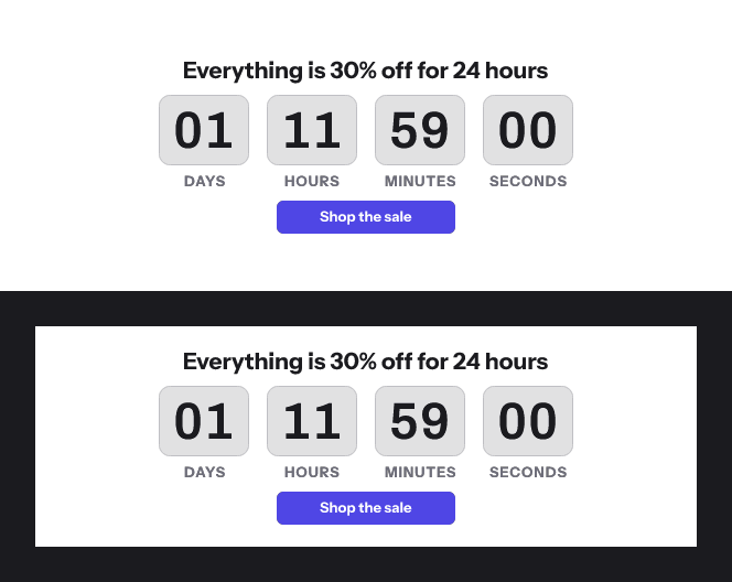
A countdown timer is a picture, and dark mode mostly changes the things around pictures: backgrounds and text. The failures to plan for are a timer drawn on white that stays white while the email around it goes dark, and a transparent timer whose edges show a pale outline.
What dark mode does to an email
Litmus tested how clients apply dark mode to an email that has no dark mode code of its own, and published a support chart dated February 2025. It sorts clients into three behaviours.
“No color changes” means the client’s interface goes dark but the email renders as designed. Litmus lists Apple Mail, Gmail on desktop, AOL and Yahoo Mail here. It notes that Apple Mail does apply a partial invert once an email includes the dark mode meta tags without styles.
A “Partial Color Invert”, in Litmus’s words, “only detects areas with light backgrounds and inverts them so the light backgrounds are dark, while the dark text becomes light.” Litmus’s chart puts Outlook.com, the Outlook apps for iOS and Android, the Gmail app for Android and Office 365 for Mac in this group.
A “Full Color Invert” is the most invasive. It “not only inverts the areas with light backgrounds, but impacts dark backgrounds as well.” Litmus names the Gmail app for iOS, Outlook 2021 for Windows, Office 365 for Windows and Windows Mail, and says those clients “don’t allow Dark Mode targeting at the moment.”
| Client, as Litmus lists it, February 2025 | What it does to an email with no dark mode code |
|---|---|
| Apple Mail (macOS), iPhone and iPad | No change. Pure white backgrounds invert if the dark mode meta tag is present |
| Outlook.com | Partial invert |
| Outlook app (iOS and Android) | Partial invert |
| Gmail app (Android) | Partial invert |
| Gmail app (iOS) | Full invert |
| Outlook 2021 and Office 365 (Windows) | Full invert |
| Windows Mail | Full invert |
The chart describes backgrounds and text, not image pixels. If a client leaves a timer’s pixels alone, a timer drawn on a white plate ends up as a white block in a darkened email. Which clients do what is also summarised on the email client pages.
Why a transparent timer gets a halo
A transparent background looks like the fix, because the email’s own colour would show through. In a GIF it is a weak one.
GIF transparency is one colour, switched on or off. The GIF89a specification defines a single “Transparency Index”, and a pixel using it means “the corresponding pixel of the display device is not modified”. There is nothing between fully drawn and fully see-through.
The edges of a digit are not fully either. Anti-aliasing makes them partly the digit’s colour and partly the background’s. In a GIF those pixels have to be blended against one fixed colour when the file is made, and they keep that blend on whatever background they land on. Blend them against white and put them on near-black, and every digit carries a faint light outline.
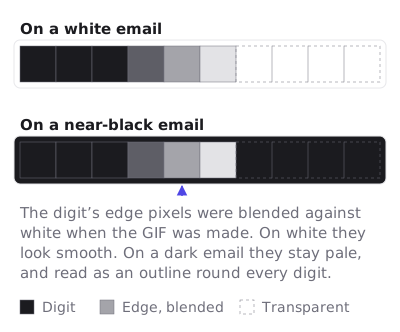
Litmus puts it in one line, in its advice on animation: “GIFs don’t support transparency well: White outlines can become pixelated due to a limited color range.”
What this product does with a transparent timer today
The editor has a Transparent switch for the colour behind the timer. When it is on, a Matte field appears, with a note to set it to your email background so the digits do not show an outline.
On 17 September 2026 I rendered a timer with the switch’s setting through the product’s engine, once on a dark canvas and once on a transparent one. Both times the area behind the digits came out solid white in every frame. The renderer blends edges against a matte that defaults to white, and it does not yet read the Matte field the editor shows. Until that changes, do not use the transparent option for a dark email. Use a solid colour instead, as below.
The gallery does not offer a dark starting point either. Every colourway in it is light, with a white or pale tinted canvas behind the timer, so a dark design starts from your own colours. The light designs are listed in countdown timer examples.
The design that reads in both
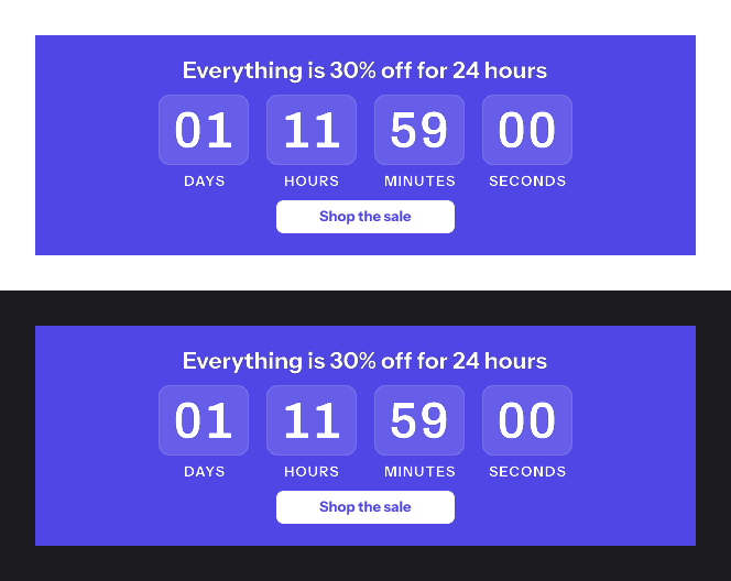
Litmus offers a choice for any graphic in dark mode. “If maintaining the look and feel is key: place the graphic on a background and flatten the image for consistency.” For a countdown, take that one.
- Give the timer its own solid panel. Set the canvas and the timer background to one colour and leave padding around the digits. The panel stays visible in a dark email, and it is meant to.
- Choose a colour that works against white and black. Litmus’s first technique is to “focus on midtones, while accounting for accessible contrast ratios”. A mid-toned brand colour with white digits reads on a light email and a dark one.
- Check the digits yourself. The renderer nudges the unit label colour until it reaches a 4.5 to 1 contrast against the timer’s background colour. It does not adjust the digits, so pick a digit colour that clears the same bar.
- Put the deadline in text next to the image. Text is what these clients recolour, so “Ends Friday 23:59 UTC” written in the email stays readable when a picture does not.
- Look at frame one against a dark background before you send. It is also the whole timer when animation is off, as countdown timers in Outlook explains. Contrast for readers with low vision, and the alt text a timer needs, are in accessible countdown timers.
The image swap, and its cost
Litmus documents a second route for clients that allow it: two images, one for light and one for dark, switched with a prefers-color-scheme media query or Outlook.com’s [data-ogsc] selector. The clients in the full invert group do not support that targeting.
Two costs apply here. Each version is a separate template, and the free plan’s listing counts three live images. And the swap works by hiding one of the two images with CSS, while Google’s sender guidelines say “Don’t use HTML and CSS to hide content in your messages. Hiding content might cause messages to be marked as spam.” A single timer on a solid panel avoids both.
Questions and answers
Does Gmail invert a countdown timer image in dark mode?
Litmus’s chart describes what Gmail does to backgrounds and text: a full invert in the iOS app and a partial invert on Android. It does not document image pixels, so design the timer to hold up if they are left alone, on a solid panel.
Should a countdown timer GIF have a transparent background?
Only when the edge colour it was made with matches the email background exactly. GIF transparency is on or off per pixel, so smooth edges carry whatever colour they were blended with. In this product the renderer does not yet read the Matte setting, so on a dark email a solid panel is the safer choice.
Why does my timer have a white outline in dark mode?
Usually because its edges were blended against white when the GIF was made. The fix is a timer drawn on a solid background colour, or a GIF made against the exact colour of the email behind it.
Can I make a light and a dark version of the same timer?
Yes, as two templates swapped by a media query in clients that support one. Weigh that against a single mid-tone design, which needs no swap and no hidden content. The guarantees the renderer makes about each frame are on features.
Sources
- The Ultimate Guide to Dark Mode for Email Marketers (Litmus, 27 February 2025), read on 17 September 2026
- Graphics Interchange Format Version 89a (W3C copy of the specification)
- Email sender guidelines (Google Workspace Admin Help)
Related
Put a countdown in the campaign you are writing now
The free plan covers 5,000 opens a month with no card. Starter is $19 a month for 250,000.