
A dark mode email is one the reader’s mail app shows on a dark background, either with dark styles you wrote or with colours the app changes for you. Some apps leave your email alone, some darken only light backgrounds and lighten dark text, and some invert nearly everything, so the same code can come out three different ways. This guide shows which client does what, with sources you can open, then each problem it causes (dark text that disappears, logos that vanish, buttons that flip colour) with the cause, the fix and the code, and ends with a complete dark mode ready template and a test checklist.
Every figure below is a browser render of example code I wrote for this page, with the dark side simulated by applying dark styles or an inverting filter. None of them is a screenshot of a real mail app, and the captions say which simulation each one uses.
The three ways mail apps handle dark mode
The CSS Color Adjustment specification from the W3C explains the root of the problem. If a reader prefers a dark colour scheme and the page has not opted out, “the user agent may override the color scheme” and “must also auto-adjust other colors into this chosen color scheme, such as by inverting their brightness”. Mail apps take that licence in different amounts. Testers usually sort them into three groups:
- No change. The app’s interface goes dark, but the email is drawn exactly as coded. Gmail in a desktop browser, Yahoo Mail and AOL behave this way in the dark mode chart Litmus published in February 2025.
- Partial invert. The app looks for light backgrounds and makes them dark, and makes dark text light. Dark backgrounds you chose are mostly left alone. Litmus puts Outlook.com, the Outlook apps for iOS and Android, the Gmail app for Android and Outlook for Mac here.
- Full invert. Light and dark areas are both changed, so a dark section you designed can turn light. Litmus lists the Gmail app for iOS, Outlook 2021 and Microsoft 365 for Windows, and Windows Mail.
A fourth case sits on top of these. Some apps honour your own dark styles, written in a @media (prefers-color-scheme: dark) block, instead of guessing. Apple Mail and iOS Mail do, and so do Samsung Email and several Outlook apps, according to caniemail.com’s tests.
Images are the constant. None of these apps recolours the pixels inside a picture. They change text colours and background colours, and your PNG, JPG or GIF stays what you exported, now on a different background. Most dark mode bugs come from that mismatch.
Which email client does what
caniemail.com tests support feature by feature; the chart from Litmus tests what each app does to an email with no dark mode code. Where the two disagree, the table says so.
| Client | With no dark mode code | Uses your prefers-color-scheme styles |
color-scheme meta tag |
|---|---|---|---|
| Apple Mail (macOS) | No change; Litmus notes pure white backgrounds are inverted once the meta tag is present | Yes (WebKit documents support from macOS 10.14.4; caniemail tested 12.4 and later) | Yes |
| iOS Mail (iPhone, iPad) | Same as Apple Mail | Yes, from iOS 13 | Untested on a dark-mode iOS (caniemail’s only test is iOS 12.4); the CSS property works on the root element |
| Gmail (desktop browser) | No change | No | No |
| Gmail app (iOS) | Full invert | No | Partial: only light only (tested September 2026) |
| Gmail app (Android) | Partial invert | No | Partial: only light only (tested September 2026) |
| Outlook.com and Outlook on the web | Partial invert, and it adds data-ogsc and data-ogsb attributes |
caniemail: yes. Litmus: no | No |
| Outlook app (iOS) | Partial invert | Yes | No |
| Outlook app (Android) | Partial invert | Yes, since a 2023 test | No |
| Outlook for Mac | Partial invert | Yes | No |
| Outlook for Windows (classic, Microsoft 365) | Full invert | No | No |
| Samsung Email (Android) | Not documented by Samsung | Yes, from version 6.1 | No (the CSS property works) |
| Yahoo Mail and AOL | No change | No; the query is rewritten so it never matches | No |
Apple’s own WebKit team describes the Mail side. Mail on macOS “displays simple email messages with a dark mode interpretation”, and declaring color-scheme: light dark “lets Mail know it supports its own styling for dark mode”, while light only tells Mail “it should not transform your light color scheme email message”. The reader can also switch it off: Apple’s Mail help lists Use dark backgrounds for messages under Settings, Viewing, and View, Message, Show with Light Background for one message.
Outlook’s documentation covers the reader’s controls, not the algorithm. Microsoft says that in dark mode “the reading pane has a dark background to reduce eye strain”, that a sun and moon button switches one message between white and black, and that classic Outlook for Windows has a Never change the message background color box. Per-client detail for Outlook, Gmail and Apple Mail is on Outlook, Gmail and Apple Mail.
Samsung Email dark mode
Samsung does not publish how its Email app recolours messages. What is tested is the CSS: caniemail records Samsung Email applying @media (prefers-color-scheme: dark) from version 6.1 and the color-scheme CSS property from 6.1, but not the meta tag (tested on 9.1). So the practical rule for Samsung is to write your own dark styles in the media query; it is the one signal the app is recorded as reading.
Problem 1: dark text that disappears
The most common complaint is text that reads on white and turns invisible in dark mode. It has two distinct causes.
Cause A: you opted in but did not set every colour. Adding <meta name="color-scheme" content="light dark"> tells Apple Mail and others that you handle dark mode. The specification then switches the browser’s default colours to the dark scheme, which means any text without an explicit colour becomes light. If that text sits in a cell where you did set background-color:#ffffff, the background stays white and the text turns white with it.
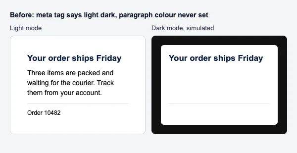
Before:
<meta name="color-scheme" content="light dark">
...
<td style="background-color:#ffffff; padding:16px;">
  <h1 style="color:#0b1f44;">Your order ships Friday</h1>
  <p>Three items are packed and waiting for the courier.</p>
</td>
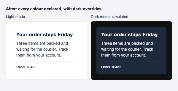
After: give every text element and every background an explicit colour, then override both in the dark block.
<style>
  @media (prefers-color-scheme: dark) {
    .card { background-color:#1e293b !important; }
    .text { color:#e2e8f0 !important; }
    .heading { color:#ffffff !important; }
  }
</style>
...
<td class="card" style="background-color:#ffffff; padding:16px;">
  <h1 class="heading" style="color:#0b1f44;">Your order ships Friday</h1>
  <p class="text" style="color:#334155;">Three items are packed and waiting for the courier.</p>
</td>
Cause B: the app lightens your text but not the thing behind it. Rémi Parmentier read Outlook.com’s dark mode code and found it changes an element’s colour when it does not reach a 4.5 to 1 contrast against Outlook.com’s own dark background. It rewrites color and background-color in CSS and color and bgcolor attributes. It does not touch a background-image. Put dark text on a light photo, and Outlook.com lightens the text to suit its dark pane while the light photo stays light. The fix is to never rely on an image alone for contrast: put text on a solid background-color (which the app will recolour together with the text), or darken the photo where the text sits. The full background image pattern, with the VML Outlook for Windows needs, is in email background images.
Problem 2: a transparent logo that vanishes
A logo exported as a transparent PNG with dark artwork works on white. In any client that darkens the background, the dark artwork lands on a dark surface and nearly disappears, because the pixels are not recoloured. The opposite export fails the opposite way: a logo saved on a white rectangle stays readable but shows as a bright box.
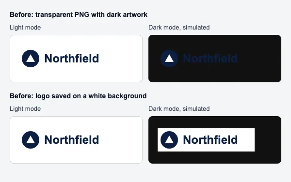
The fixes, in order of preference, use one image that works on both backgrounds:
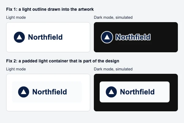
- Draw a light outline or glow into the artwork. A 2 to 4 pixel white or near-white stroke around dark shapes is invisible on white and separates the logo from a dark background. Litmus’s guide recommends a translucent glow for “transparent PNGs with dark text”.
- Put the logo on a padded light container that is part of the design. A soft off-white plate with rounded corners reads as intentional in both modes, unlike a hard white rectangle cropped to the artwork.
- Use a mid-tone version of the logo. A colour that keeps contrast against white and against near-black needs no outline at all. WCAG exempts logotypes from its contrast minimum, but readers are not exempt from squinting, so check it against both backgrounds.
There is a fourth option, and it has a cost. You can ship two logos and show the light one only in dark mode with the media query, hiding the other with display:none. That works in the clients that support the query (and in Outlook.com via [data-ogsc]), but not in the full invert clients, and it works by hiding an image. Google’s sender guidelines say: “Don’t use HTML and CSS to hide content in your messages. Hiding content might cause messages to be marked as spam.” A preheader hidden in the standard way is a short line of real summary text; the risk Google describes is hidden content that differs from what the reader sees. Treat the swap as a trade-off, not the default. The same logic, applied to signature logos, is in email signature dark mode, and the code for the signature itself is in HTML email signature.
Problem 3: white-background images that glow
Product shots on white, screenshots and banners with a white margin all become bright rectangles once the surrounding email goes dark. Nothing recolours them, and in a dark room a large white block is the first thing a reader sees.
Fix it in the image, not the code: cut product photos out onto transparency with a soft shadow that works on either background, or give banners a mid-tone background colour that belongs to the design. When an image must be on white, put it inside a light card with padding so the brightness has a frame. Image dimensions and file weight are covered in email image size.
Problem 4: buttons whose colours get inverted
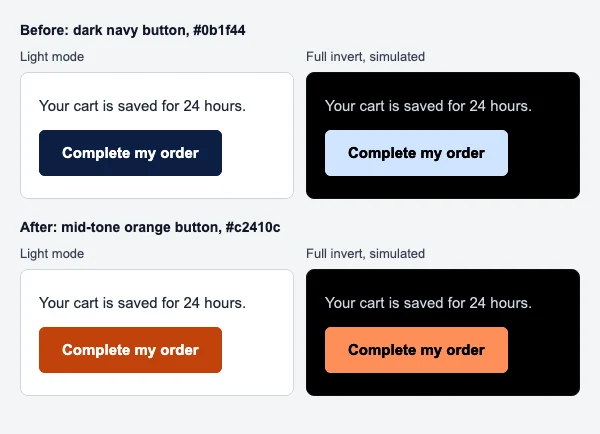
A dark navy button with white text is ideal in light mode. A full invert client flips both: the navy becomes pale blue and the white label becomes near-black. It is readable but no longer looks like your brand, and a light button can disappear against a light-inverted section.
What holds up:
- Choose a mid-tone button colour. Inversion swaps lightness, so a colour in the middle of the lightness range changes least. Keep the label at 4.5 to 1 contrast: white on
#c2410cclears it, white on a brighter orange like#f97316does not. - Set the background on the cell and the link. A bulletproof button puts
bgcolorandbackground-coloron the<td>, and can repeat the colour as a border on the<a>, as in the snippet below, so the whole button is recoloured as one surface. The full code, including the VML roundrect for Outlook for Windows, is in HTML email buttons. - Override it in dark mode if you want a different shade there, with a class in the media query and in the
[data-ogsb]block.
Problem 5: borders and dividers that vanish or glare
Outlook.com rewrites colours and backgrounds; Parmentier’s list of the attributes it changes does not include border-color. So a light grey #e5e7eb divider can stay light grey on a darkened card and turn into a bright line, and a dark #111111 rule disappears on a dark background. Pick a border in the middle (a slate around #94a3b8 reads on white and on near-black), and override it in your dark block with border-top-color. A divider drawn as a background-color on a 1 pixel cell gets recoloured like any other background, which may darken it into the card, so test whichever you use.
Problem 6: pure #000000 and #ffffff are treated specially
Two exact values get extra attention. Litmus’s chart notes that in Apple Mail and iOS Mail, “Pure white (#ffffff) BGs will be inverted if <meta> is present”, and its accessibility advice says white on pure black “might be automatically inverted by some email clients”. A common community workaround is to use near values such as #fefefe and #010101 so a client that keys on the exact colour leaves them alone.
Know the limit: Outlook.com decides by contrast, not by exact value, so #fefefe is darkened just like #ffffff there. The dependable fix is not a magic hex code but dark styles of your own wherever they are supported, and colours that read either way where they are not.
Problem 7: background images, emoji and icons
Background images are images, so they are never recoloured, while text on top of them may be. Always give the cell a background-color close to the image’s average tone. In clients that recolour, that colour moves with the text; in clients that drop the image, the text still has contrast.
Emoji are characters drawn from the device’s colour emoji font. Mail apps change text colour, but colour emoji ignore it, so dark emoji such as a black heart or a black circle sink into a dark background. Use them as decoration, never as the only carrier of meaning.
Icons depend on how they are made. A PNG icon behaves like the logo above: give it an outline, a plate, or a mid-tone. A plain text symbol such as ✓ or ★ is text, so it is recoloured with the paragraph and stays readable.
Controlling dark mode CSS
You have four tools, and each reaches different clients.
1. Declare support with meta tags and color-scheme
<meta name="color-scheme" content="light dark">
<meta name="supported-color-schemes" content="light dark">
<style>
  :root { color-scheme: light dark; supported-color-schemes: light dark; }
</style>
color-schemeis the standard name, defined in the W3C specification and documented on MDN as both a meta tag and a CSS property.supported-color-schemesis the old name. WebKit’s announcement says Mail on macOS 10.14.4 supported it before the rename, so it is kept for older Apple devices.- caniemail records the property working in Apple Mail only on the root element, so put it on
:rootrather than on individual tables. - Declaring
light darkis a promise. In the clients that honour it, default colours flip to dark, so every colour in the email must be explicit (Problem 1).
2. Write the dark styles in a prefers-color-scheme block
@media (prefers-color-scheme: dark) {
  .page    { background-color:#0f172a !important; }
  .card    { background-color:#1e293b !important; }
  .heading { color:#ffffff !important; }
  .text    { color:#e2e8f0 !important; }
  .link    { color:#93c5fd !important; }
  .rule    { border-top-color:#334155 !important; }
}
The !important is required, because your light colours are inline styles and an inline style beats a normal stylesheet rule. MDN documents the media feature; caniemail lists the clients that apply it, as in the table above.
One catch, which Parmentier documented: a media query reads the operating system’s setting, not the mail app’s. If Outlook.com is showing a message on a light pane while the computer is in dark mode, the query still matches. His fix excludes Outlook.com from the media query, using the x_ prefix Outlook.com adds to every class:
@media (prefers-color-scheme: dark) {
  .card:not([class^="x_"]) { background-color:#1e293b !important; }
}
3. Target Outlook.com with data-ogsc and data-ogsb
When Outlook.com recolours an element, it records the original on the element in a data attribute: data-ogsc (original style colour), data-ogsb (original style background), data-ogac and data-ogab (the color and bgcolor attributes). caniemail’s notes confirm the attributes appear in Outlook.com, Outlook for Mac and the Outlook mobile apps. Because they exist only while dark mode is on, they make a selector that follows Outlook.com’s own sun and moon toggle.
Outlook.com supports an attribute selector on its own or with an element name, so you cannot write .card[data-ogsb]. Parmentier’s pattern is to give an outer wrapper a light background, which Outlook.com is sure to change, and select descendants of it:
[data-ogsb] .card    { background-color:#1e293b !important; }
[data-ogsb] .heading { color:#ffffff !important; }
[data-ogsc] .text    { color:#e2e8f0 !important; }
4. Gmail: u + .body, a community technique
Gmail does not support prefers-color-scheme anywhere in caniemail’s tests, and Google’s CSS page lists only class, element and ID selectors. The Gmail apps recolour on their own. The best known workaround is again Parmentier’s, and it is a community technique, not something Google documents.
As he described it in 2021, Gmail replaces the doctype with an empty <u></u> element, so with <!DOCTYPE html> at the top and <body class="body">, the selector u + .body .foo matches only inside Gmail. He combined that with two nested mix-blend-mode layers, screen and difference, to bring white text on a coloured background back after the Gmail iOS app has inverted it:
<style>
  u + .body .gmail-blend-screen { background:#000; mix-blend-mode:screen; }
  u + .body .gmail-blend-difference { background:#000; mix-blend-mode:difference; }
</style>
<div style="background:#639; background-image:linear-gradient(#639,#639); color:#fff;">
  <div class="gmail-blend-screen">
    <div class="gmail-blend-difference">White text that stays white in Gmail's dark mode.</div>
  </div>
</div>
He is clear about the limit: it keeps white text only. Keep the dark mode rules in their own <style> block, separate from your layout styles, so whatever Gmail does with selectors it does not support cannot reach the rest.
Classic Outlook for Windows
Classic Outlook ignores all of the above. Nicole Merlin’s tutorial on Envato Tuts+ describes one community technique: a single-colour Word text gradient (mso-style-textfill-type:gradient) in a <!--[if gte mso 16]> block, which Outlook shows in light mode and discards in dark mode, revealing a fallback colour you choose. It is fiddly and per element; read her walkthrough before using it.
The honest limits
- You cannot give the Gmail apps or classic Outlook your own dark design. They apply their own.
- You can switch recolouring off only in some apps. caniemail’s September 2026 test records the Gmail apps honouring
<meta name="color-scheme" content="light only">, and Apple’s WebKit post says Mail honourslight onlytoo. That opts the email out of recolouring, which the specification allows through itsonlykeyword. Use it sparingly: the reader chose dark mode, and a white email at night works against that choice. - Test results age. caniemail’s three dark mode pages were last tested between March 2023 and September 2026, and apps change without notice.
A complete dark mode ready email
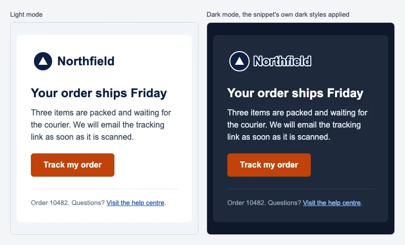
This is the snippet the figure after the code renders. It combines the meta tags, a single outlined logo, explicit colours on every element, a media query that excludes Outlook.com, Outlook.com’s own selectors, and a mid-tone button. Replace the image and link addresses with your own. For the wider layout skeleton it sits inside, see the HTML email template, and for how that skeleton works, the HTML email guide.
<!DOCTYPE html>
<html lang="en" xmlns:v="urn:schemas-microsoft-com:vml" xmlns:o="urn:schemas-microsoft-com:office:office">
<head>
<meta charset="utf-8">
<meta name="viewport" content="width=device-width, initial-scale=1">
<meta name="color-scheme" content="light dark">
<meta name="supported-color-schemes" content="light dark">
<title>Your order ships Friday</title>
<!--[if mso]>
<noscript><xml><o:OfficeDocumentSettings><o:PixelsPerInch>96</o:PixelsPerInch></o:OfficeDocumentSettings></xml></noscript>
<![endif]-->
<style>
:root { color-scheme: light dark; supported-color-schemes: light dark; }
body { margin: 0; padding: 0; width: 100%; }
img { border: 0; display: block; }
</style>
<style>
/* Dark mode for clients that support the media query */
@media (prefers-color-scheme: dark) {
.body:not([class^="x_"]), .wrapper:not([class^="x_"]) { background-color: #0f172a !important; }
.page:not([class^="x_"]) { background-color: #0f172a !important; }
.card:not([class^="x_"]) { background-color: #1e293b !important; }
.heading:not([class^="x_"]) { color: #ffffff !important; }
.text:not([class^="x_"]) { color: #e2e8f0 !important; }
.muted:not([class^="x_"]) { color: #94a3b8 !important; }
.link:not([class^="x_"]) { color: #93c5fd !important; }
.rule:not([class^="x_"]) { border-top-color: #334155 !important; }
}
/* Outlook.com: follows its own sun and moon toggle */
[data-ogsb] .page { background-color: #0f172a !important; }
[data-ogsb] .card { background-color: #1e293b !important; }
[data-ogsb] .heading { color: #ffffff !important; }
[data-ogsb] .text { color: #e2e8f0 !important; }
[data-ogsb] .muted { color: #94a3b8 !important; }
[data-ogsb] .link { color: #93c5fd !important; }
[data-ogsb] .rule { border-top-color: #334155 !important; }
</style>
</head>
<body class="body" style="margin:0; padding:0; background-color:#f1f5f9;">
<div class="wrapper" style="background-color:#f1f5f9;">
<table role="presentation" class="page" width="100%" cellpadding="0" cellspacing="0" border="0" style="background-color:#f1f5f9;">
<tr>
<td align="center" style="padding:24px 12px;">
<!--[if mso]><table role="presentation" width="600" cellpadding="0" cellspacing="0" border="0"><tr><td><![endif]-->
<table role="presentation" class="card" width="100%" cellpadding="0" cellspacing="0" border="0" style="max-width:600px; background-color:#ffffff; border-radius:8px;">
<tr>
<td style="padding:28px 28px 8px 28px;">
<img src="https://example.com/logo-outlined.png" width="200" height="48" alt="Northfield" style="display:block; width:200px; height:48px; color:#0b1f44; font-family:Arial, Helvetica, sans-serif; font-size:20px; font-weight:bold;">
</td>
</tr>
<tr>
<td style="padding:16px 28px 0 28px;">
<h1 class="heading" style="margin:0 0 12px 0; font-family:Arial, Helvetica, sans-serif; font-size:24px; line-height:30px; color:#0b1f44;">Your order ships Friday</h1>
<p class="text" style="margin:0 0 20px 0; font-family:Arial, Helvetica, sans-serif; font-size:16px; line-height:24px; color:#334155;">Three items are packed and waiting for the courier. We will email the tracking link as soon as it is scanned.</p>
</td>
</tr>
<tr>
<td style="padding:0 28px 24px 28px;">
<table role="presentation" cellpadding="0" cellspacing="0" border="0">
<tr>
<td bgcolor="#c2410c" style="background-color:#c2410c; border-radius:6px;">
<a href="https://example.com/orders/10482" style="display:inline-block; padding:12px 24px; font-family:Arial, Helvetica, sans-serif; font-size:16px; line-height:20px; font-weight:bold; color:#ffffff; text-decoration:none; border:1px solid #c2410c; border-radius:6px;">Track my order</a>
</td>
</tr>
</table>
</td>
</tr>
<tr>
<td style="padding:0 28px 28px 28px;">
<div class="rule" style="border-top:1px solid #e2e8f0; font-size:0; line-height:0; height:1px;"> </div>
<p class="muted" style="margin:16px 0 0 0; font-family:Arial, Helvetica, sans-serif; font-size:13px; line-height:20px; color:#64748b;">Order 10482. Questions? <a class="link" href="https://example.com/help" style="color:#1d4ed8; text-decoration:underline;">Visit the help centre</a>.</p>
</td>
</tr>
</table>
<!--[if mso]></td></tr></table><![endif]-->
</td>
</tr>
</table>
</div>
</body>
</html>
Line by line, the parts that are about dark mode:
.bodyand.wrapperin the dark block repaint the outer background, which would otherwise stay light grey.- The two meta tags and
:rootdeclare light and dark support for Apple Mail, iOS Mail, Samsung Email and others. - Two
<style>blocks. Layout in the first, dark mode in the second, so a client that rejects attribute selectors cannot take the layout with it. :not([class^="x_"])keeps the media query from firing in Outlook.com, where the[data-ogsb]rules take over and follow the reader’s toggle..wrapperwith a light background is the element Outlook.com marks withdata-ogsb, which the descendant selectors rely on.- Every text element has an inline colour, so nothing falls back to a default that flips.
- The logo is one image with a light outline baked in, so no hiding is needed.
- The
<!--[if mso]>table fixes the width at 600 pixels in classic Outlook, which does not understandmax-width; theOfficeDocumentSettingsblock stops Outlook scaling images on high DPI screens. - The button is a mid-tone
#c2410cwith white text at more than 4.5 to 1, set on the cell and repeated as the link’s border.
Dark mode email testing checklist
- Every text element and every background has an explicit colour, inline.
- The meta tags and
:root { color-scheme }are present, and the dark rules use!important. - The dark rules sit in their own
<style>block, and each one is repeated with a[data-ogsb]or[data-ogsc]prefix for Outlook.com. - Logos and icons have an outline, a plate or a mid-tone colour; nothing important is a dark shape on transparency.
- No white-margin images sit loose on the page; product shots are cut out or framed.
- Button labels clear 4.5 to 1 against the button in both modes, per WCAG 1.4.3.
- Text on a background image also has a solid
background-colorbehind it. - Dividers are mid-tone or overridden in dark mode.
- Open the email in Apple Mail or iOS Mail with dark mode on, then use Show with Light Background to compare.
- Open it in Outlook.com, then use the sun button to switch the message back; your
[data-ogsb]styles should switch with it. - Open it in the Gmail app on iOS and on Android with the theme set to dark, and read every line.
- Open it in classic Outlook for Windows with the Black theme.
- If you send with Gmail itself, check the result after sending as described in send HTML email from Gmail, and keep the file under Gmail’s clipping point described in Gmail clipped message; long dark mode CSS adds weight.
- Run through the wider email accessibility checks; dark mode is one part of contrast, not all of it.
Timers and other live images in dark mode
A countdown timer or personalized image from EmailTimer.app is a picture, so in dark mode it follows the logo rule above: no mail app recolours its pixels, and it needs a background colour of its own. Design it on an opaque background in a mid-tone that reads on a white email and a dark one, with light digits at 4.5 to 1 contrast, and avoid a transparent background, which leaves a pale halo around the digits on dark. Dark mode countdown timers shows that design side by side. You can build an email countdown timer in the editor or start in the free countdown timer generator. Plans and free limits are on pricing.
Questions and answers
What is dark mode email?
It is an email shown on a dark background because the reader turned on dark mode in their mail app or device. Depending on the app, it shows dark styles the sender wrote, recolours light backgrounds and dark text on its own, or inverts nearly everything.
How do I make an HTML email dark mode friendly?
Set an explicit colour on every text element and background, add the color-scheme meta tags, and write dark overrides with !important in a prefers-color-scheme: dark media query. Repeat those rules with a [data-ogsb] prefix for Outlook.com, and make logos and buttons that read on both backgrounds.
Why does my email text disappear in dark mode?
Usually because a text colour was never set, so it flipped to white, while a background you did set stayed white. The other cause is an app lightening your text for its dark pane while a light background image behind it stays light.
Does Gmail support dark mode CSS?
No. caniemail’s tests show no support for prefers-color-scheme in Gmail on the web, iOS or Android. The Gmail apps recolour emails themselves; the only control recorded, in a September 2026 test, is opting out with light only.
How do I stop Gmail from inverting my email colours?
You cannot give the Gmail apps your own dark design. caniemail records them honouring <meta name="color-scheme" content="light only">, which opts the email out of recolouring, but that overrides the reader’s choice. The blend mode technique keeps white text white in the iOS app.
How do I fix Outlook dark mode in an email?
For Outlook.com and the Outlook mobile apps, write dark styles prefixed with [data-ogsb] or [data-ogsc], which Outlook adds when it recolours. Classic Outlook for Windows supports no dark mode CSS, so use colours that survive inversion, or the MSO text gradient technique for specific text.
Why does Outlook change my email background colour in dark mode?
Outlook.com and the Outlook apps darken light backgrounds that lack contrast against their dark reading pane, and record the original in data-ogsb. A reader can switch one message back with the sun button, and classic Outlook offers Never change the message background color.
How does Samsung Email handle dark mode?
Samsung does not document its recolouring. caniemail records Samsung Email applying prefers-color-scheme styles from version 6.1 and the color-scheme CSS property, but not the meta tag, so write your own dark styles in the media query.
What does the color-scheme meta tag do in email?
It tells the client which colour schemes the email supports. light dark says you handle both, and supporting clients use your dark styles and flip default colours. light only asks the client not to recolour, which Apple Mail and, in a September 2026 test, the Gmail apps honour.
Should I use #000000 and #ffffff in a dark mode email?
Avoid relying on them. Litmus notes Apple Mail inverts pure white backgrounds once the meta tag is present, so many developers use near values such as #fefefe. That does not help in Outlook.com, which decides by contrast, so dark styles of your own matter more.
How do I make a logo work in dark mode email?
Use one image that reads on both backgrounds: add a light outline or glow to dark artwork, place it on a padded light plate that belongs to the design, or use a mid-tone colour. Swapping two logos with CSS hides one image, which Google’s sender guidelines warn against.
How do I test dark mode emails?
Send the email to real accounts and open it with dark mode on in Apple Mail, Outlook.com, the Gmail apps on iOS and Android, and classic Outlook for Windows. Compare with each app’s light switch, and read every line, button and logo.
Sources
- @media (prefers-color-scheme) support in email clients (caniemail.com), read on 21 November 2026
- color-scheme CSS property support in email clients (caniemail.com), read on 21 November 2026
- color-scheme meta tag support in email clients (caniemail.com, tested 16 September 2026), read on 21 November 2026
- Samsung Email support overview (caniemail.com), read on 21 November 2026
- CSS Color Adjustment Module Level 1 (W3C Candidate Recommendation)
- prefers-color-scheme (MDN Web Docs)
- color-scheme (MDN Web Docs)
- <meta name="color-scheme"> (MDN Web Docs)
- Dark Mode Support in WebKit (WebKit blog, Apple)
- Dark Mode in Outlook (Microsoft Support), read on 21 November 2026
- Dark mode in Outlook.com and Outlook on the web (Microsoft Support), read on 21 November 2026
- Change Viewing settings in Mail on Mac (Apple Support)
- CSS support (Gmail, Google for Developers)
- Email sender guidelines (Google Workspace Admin Help)
- Making Emails React to Outlook.com's Dark Mode (Rémi Parmentier, 26 February 2021)
- Fixing Gmail's dark mode issues with CSS Blend Modes (Rémi Parmentier, 9 April 2021)
- How To Fix Outlook Dark Mode Problems (Nicole Merlin, Envato Tuts+, 1 September 2023)
- Understanding Success Criterion 1.4.3: Contrast (Minimum) (W3C WAI)
- The Ultimate Guide to Dark Mode for Email Marketers (Litmus, 27 February 2025), read on 21 November 2026
Related
- Free responsive HTML email template, explained line by line
- HTML email buttons that work in every inbox, Outlook included
- Email background images that work in Outlook, Gmail and Apple Mail
- Email signature dark mode: why logos break, and how to fix them
- Dark mode countdown timers: keeping timers and images readable
Put a countdown in the campaign you are writing now
The free plan covers 5,000 opens a month with no card. Starter is $24 a month for 250,000.