Countdown timers on phones, app by app
By Danish Mohammed, founder. 7 min read
Most people will read your email on a phone, and the phone is where a countdown timer is most likely to look wrong. Two separate problems cause it. One is which app fetched the image and when. The other is that a 600 pixel wide image drawn on a 390 point wide screen is being asked to supply more than 600 pixels.
This page takes the four apps that matter, then the sizing arithmetic.
App by app
The Gmail app, Android and iOS
Google documents one mechanism for images and it is not client-specific. Its Workspace admin guidance states: “When your users open email messages, Gmail uses Google’s secure proxy servers to serve images that might be included in these messages.” The same proxy sits in front of the app as in front of the web client.
Google’s user-facing page says “By default, when you get an email with an image, you’ll see the image automatically”, with the alternative setting named “Ask before displaying external images”. Google publishes no cache lifetime for the proxy. Anyone quoting you a number for Gmail is quoting an observation.
For a timer, the practical shape is: the first open is live, and a later open of the same message can be served from a copy the proxy already holds. Design so that a stale copy still says something true, which means a written deadline and a configured expired image.
Outlook mobile, iOS and Android
Outlook for iOS and Android are native apps on their own rendering stack rather than the Word engine classic Outlook on Windows uses. Microsoft publishes nothing about GIF playback in either of them.
The most useful public evidence is the unresolved Microsoft Q&A thread of 7 May 2025 about timers showing an incorrect time. The reporter writes that “the issues seem to appear on both the desktop application and the web version, but the mobile Outlook still works fine on Android and iOS”. That is one reporter on Microsoft’s own forum rather than a Microsoft commitment, and it is the strongest public signal there is.
So mobile Outlook looks like the best case in the Outlook family, and the desktop case is the one that decides your design. Countdown timers in Outlook has the version table.
Apple Mail on iOS
This is the one that changes the arithmetic rather than the pixels. Apple’s privacy page describes Protect Mail Activity as a feature that “downloads remote content in the background by default”, which means the image is fetched before anyone opens the message. The timer therefore shows the time remaining as of that fetch.
On timing, FreshInbox’s 2021 testing reports that it takes the client “anywhere from several minutes usually around 20 minutes to more than 8 hours to begin downloading images in the background”. The same testing notes that “the device tends to hold off on downloading images in the background if the device is not connected to a power source or not on Wifi”. It puts the resulting cache at “2-3 days”. Those are third-party test findings. Apple publishes no cache lifetime.
The design consequence is specific: use a fixed deadline for a broadcast to an Apple-heavy list. An absolute instant stays arithmetically correct no matter when the picture was drawn. A relative clock does not. The Apple Mail page covers the mitigations.
Some recipients turn the feature off, and then the fetch happens at the open like any other client. You cannot tell which recipients are which, so design for the prefetch and treat the live case as a bonus.
Samsung Mail
Samsung publishes no rendering documentation for its Email app. There is no compatibility page, no statement about animated GIFs, and no description of image handling. The image setting is discussed in Samsung’s own community forum by users rather than in a help article.
I will not put a tick in a compatibility table for a client whose vendor documents nothing. Treat Samsung Mail as undocumented, assume images can be off, and make frame one correct on its own. That assumption costs you nothing anywhere else.
The sizing problem that makes digits look soft
This is the mobile-specific one, and almost nothing in this category explains it.
A phone screen reports its width in points, not pixels. A 390 point wide layout on a modern iPhone is backed by a display running two or three physical pixels per point. Litmus puts the general rule plainly: “Roughly speaking, high-DPI displays have twice as many pixels per inch than their traditional counterparts. For images to look good on those screens, they need to be twice as large.”
Now apply that to a timer. A 600 pixel wide email image is typically scaled down to fit the phone’s width, which sounds safe. It is safe for a photograph. It is not safe for digits, because a countdown is thin strokes and hard edges at a small size, and resampling eats exactly that. The result is numbers that look slightly furry while the rest of the email looks fine.
The fix is to export at twice the display width and let the HTML scale it back down. Litmus describes the same move: “in our HTML, we use the original, intended display size in the width and height attributes to scale the larger image down”.
For a timer that means:
- Decide the display width first. For a single-column email that is usually 600, sometimes 480 or 300.
- Render the image at twice that width. A 600 wide slot wants a 1200 wide image.
- Set
width="600"on the<img>tag anyway. The browser and the mail client scale it down, and the extra pixels go into edge quality. - Watch the file size. A GIF at 2x carries roughly four times the pixels, and an oversized animation hurts the text-to-image ratio that spam filters look at.
- Prefer fewer units on a phone. Days and hours at 2x look better than days, hours, minutes and seconds crammed into the same width.
No email client vendor documents device pixel ratio for mail rendering, so this section is arithmetic and typographic judgement rather than a quoted policy. The arithmetic is not controversial.
What EmailTimer.App does about it
Three sizes are offered, 600x200, 600x300 and 300x250, and the renderer emits the digits at the density the size calls for rather than upscaling a small plate. The digit face is Archivo, chosen because it holds its strokes at small sizes.
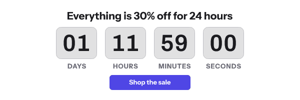
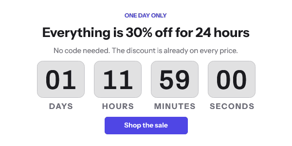
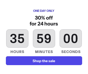
Frame one is a complete full-canvas image with the live numbers painted in, so an app that does not animate still shows a correct still countdown.
The GIF loops by default, so on a phone, where a message stays open while someone reads, the seconds keep moving. Each pass jumps back by the length of the animation. If that jump matters more to you than the motion, set the template’s “At the end” setting to Hold: it plays once and keeps its last frame on screen.
Every request returns HTTP 200 and a valid image, degraded to a fallback if anything upstream fails, because a delivered email cannot be recalled. The features page lists the rest of what the renderer guarantees.
Questions and answers
Why does my countdown timer look blurry on a phone?
Almost always because the image was exported at its display width rather than at twice it. Phone screens draw two or three physical pixels per point, so a 600 pixel image in a 600 point slot is short of pixels for the digits. Export at 1200 and set width="600".
Does the Gmail app show a live countdown?
The first open does. Gmail serves images through Google’s proxy, and Google publishes no cache lifetime, so a later open of the same message may show an older copy. Put the deadline in text next to the image.
Does Outlook mobile work better than Outlook desktop?
On the evidence available, yes. The reporter in Microsoft’s May 2025 Q&A thread found mobile Outlook showing the correct time while desktop and web did not. That is one public report rather than a Microsoft statement.
What happens in Apple Mail on an iPhone?
With Protect Mail Activity on, Apple downloads remote content in the background by default, so the timer reflects the time remaining at that background fetch. Use a fixed deadline for those sends and the number stays correct.
Does Samsung Mail support animated countdown timers?
Samsung publishes nothing about it. Build for the frame-one case and the question stops mattering, which is the same advice that covers Outlook on Windows.
Should I show seconds on mobile?
Rarely. Seconds are the first unit to look wrong on a still frame or a cached copy, and they cost the most width. Hours and minutes read better and stay true for longer.
Next: countdown timers in Gmail, countdown timers in Outlook, and how email image caching works for the per-provider mechanism behind all of this.
Sources
- Set up an image URL proxy allowlist (Google Workspace Admin Help)
- Show images in Gmail (Google Help)
- Mail Privacy Protection (Apple legal)
- Protect email privacy in Mail on Mac (Apple Support)
- A Technical Take on iOS15 Mail Privacy Protection (FreshInbox, 29 July 2021)
- Why animated gif countdown timers aren't showing correct time in Outlook Email Client (Microsoft Q&A, 7 May 2025)
- Understanding Retina Images in HTML Email (Litmus), read on 17 September 2026
Related
Put a countdown in the campaign you are writing now
The free plan covers 5,000 opens a month with no card. Starter is $19 a month for 250,000.