Fonts in a timer, and where font upload stands
By Danish Mohammed, founder. 4 min read
The fonts in a timer image are drawn into the pixels by the renderer, so a reader’s mail client never needs them installed. What the renderer can draw with is its own set of font files, and today there is no way to add one of yours to it.
Uploading your own font file
The dashboard does not accept a font file today. The Assets screen takes images only: PNG, JPEG, GIF and WebP, up to 5 MB each. There is no field for a .woff2 or .ttf file anywhere in the editor or the API.
The pricing page lists brand fonts on Starter and above. Until an upload exists, a brand face that is not in the catalogue cannot be used for live text or digits. Two workarounds hold in the meantime. Set fixed brand lettering, such as a logo or a headline that never changes, as an image layer. For the countdown digits, pick the closest family from the catalogue.
Picking a font in the editor
The editor has a font picker on text layers and a “Digit font” picker on the timer layer. Both search a catalogue of freely licensed families by name, category or script, so typing “mono” or “devanagari” narrows the list in one word. The picker’s own note reads “Every font here is free to use in commercial email.”
A timer’s digits default to Archivo. Archivo is published under the SIL Open Font License 1.1, in Google’s fonts repository. Text layers default to Instrument Sans.
The editor itself only loads three faces for its live preview. The timer panel says so under the picker: “Fonts beyond the three that ship with the editor appear in the published image, not in this preview.” So pick the family, publish, and open the image address in a browser to see the face as recipients will.
What publishing checks
Before a template goes live, publishing asks the font catalogue whether the renderer can load every family the timer names. If one is missing, the publish is refused rather than quietly drawn in a different face. The refusal names the font and says it “is not one the renderer can load, so the timer would be drawn in a different face. Choose a font from the list and publish again.”
A substituted face changes every digit’s width, so a timer that looked centred in the editor would sit off-centre in the inbox. If the catalogue itself cannot be read at that moment, the publish goes ahead and the check is skipped rather than blocking you on a problem of ours. The same publish step also renders the template once and refuses it if the result is the plain grey card, which what a timer shows when it is not counting down describes.
Fonts in a Photoshop import
A Photoshop file can name any font installed on the designer’s machine, and the file does not carry a font the renderer can use. The import refuses digits set in a typeface outside the catalogue. Its reason: “There is no lawful way for us to draw with it from your file, and substituting a lookalike would change every digit width and move your layout, so we will not.”
It also refuses faux bold, which is Photoshop thickening a font that has no bold weight, and digits whose widths differ from one numeral to the next. PSD countdown timers covers the rest of the import. Its template is set in Archivo Bold, the renderer’s default digit face.
Labels in other scripts
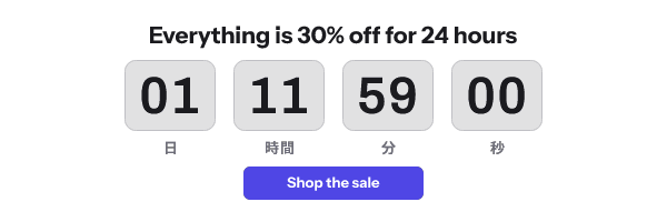
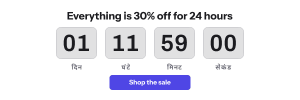
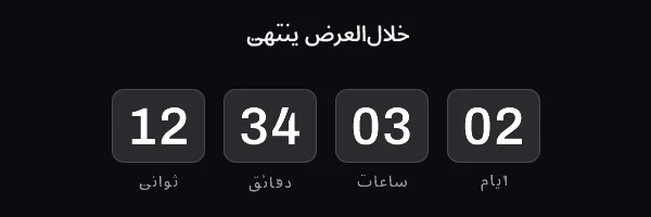
Unit labels ship in 44 languages, including Arabic, Hebrew, Hindi, Thai, Japanese, Korean and both Chinese scripts. Right-to-left languages reverse the order of the units, while the digits inside each unit still read left to right. The renderer ships Noto Sans faces for those scripts, so the built-in labels draw without any catalogue lookup.
Questions and answers
Can I upload my brand font?
Not today. The Assets screen accepts images only, and neither the editor nor the API takes a font file.
Do my subscribers need the font installed?
No. The font is drawn into the image on the server, so the reader’s device only ever receives pixels.
Why does the editor preview show a different font from the one I picked?
The editor preview loads three faces only. The published image uses the family you picked, and publishing refuses a family the renderer cannot load.
Which font is safest for countdown digits?
One whose numerals all share a width, so the countdown does not shift sideways as it ticks. A Photoshop import measures that for the font your file uses and refuses one that fails.
Sources
Related
Put a countdown in the campaign you are writing now
The free plan covers 5,000 opens a month with no card. Starter is $19 a month for 250,000.